24h
60m
60s
Botanical, premium, alcohol-free gin inspired by the woodland, mossy landscape.
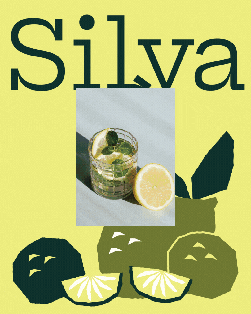
Silva is a botanical, alcohol-free gin brand inspired by woodland landscapes, fresh citrus, and the beauty of imperfection. The visual identity blends organic illustration with modern design to create a refined yet approachable premium experience.

(CREATIVE DIRECTION)
The creative direction for Silva brings together earthy, organic forms with zesty, vibrant colour, grounded in the imagery of greenery and natural landscapes. The brand was developed to feel authentic and tactile, balancing a hand-crafted aesthetic with a modern, contemporary edge.

Organic, imperfect illustrations inspired by natural forms create a gentle sense of movement throughout the label. These elements sit at the heart of the design, adding warmth and character while inviting the audience to experience the harmony and artistry behind the product.
To contrast the raw, organic shapes, a modern slab serif typeface Hepta Slab was introduced. Its structured yet distinctive form adds clarity and sophistication, elevating the design while keeping it approachable and unpretentious.

The colour palette plays a key role in expressing Silva’s botanical character. A bright lime yellow captures the energy and zest of lemon and lime, while mossy, muted greens introduce a sense of calm and grounding, echoing the brand’s connection to nature.
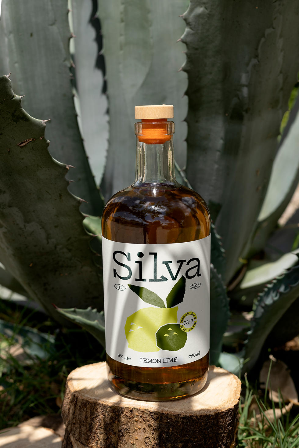
Photography and mockups were carefully selected to reinforce the mossy, woodland atmosphere of the brand. Natural, textural imagery enhances the fresh, alcohol-free proposition, while contemporary product mockups from Bendito complement the modern positioning and premium finish of the Silva range.